Book cover design tips can mean the difference between a book that catches a reader’s eye and one that gets scrolled past without a second glance. For self-published authors especially, the cover is often the very first interaction a potential reader has with your work. It happens in under two seconds, usually as a tiny thumbnail on a retailer page, and in that moment, the reader has already formed an opinion about your book.
We have worked with authors who wrote exceptional books but struggled with sales simply because their cover was not doing its job. And we have seen the opposite just as often. Authors with solid but not extraordinary manuscripts who sold consistently because their cover communicated exactly the right things to exactly the right readers.
What You’ll Learn About Book Cover Design
This guide gives you a practical, experience-backed breakdown of what works and what fails. Here is what you will learn:
- Why your book cover is a sales tool, not an art project
- Book cover design tips that work across every genre
- Common mistakes that make self-published book covers look amateur
- How to design a book cover that passes the thumbnail test
- What a book cover design cost looks like at different quality levels
- When to hire a professional and how to find the right one
Why Your Book Cover Is the Most Important Marketing Decision You Will Make
Before diving into specific book cover design tips, it helps to understand why the cover carries so much weight in the self-publishing world. Traditional publishers invest thousands of dollars into cover development because they understand something many first-time authors underestimate. Readers judge books by their covers constantly and unapologetically.
A self-published book cover has to work even harder than a traditionally published one. It does not have the benefit of bookstore shelf placement, publisher brand recognition, or a sales team pitching it to retailers. It has to fight for attention in a sea of thumbnails on Amazon, Apple Books, Kobo, and every other digital storefront. And it has roughly two seconds to win that fight.
We tell every author we work with the same thing. Your cover must act as a visual billboard. It needs to communicate what the book is about, who it is for, and what genre it belongs to, all before the reader has read a single word of your description. When it does that well, everything else in your marketing works better; and when it does not, even the strongest description and the best advertising will underperform.
Book Cover Design Tips That Actually Work
The difference between covers that sell and covers that sit unseen almost always comes down to a few fundamental principles. These are the book cover design tips we share with every author before they begin the design process.
Genre Signaling
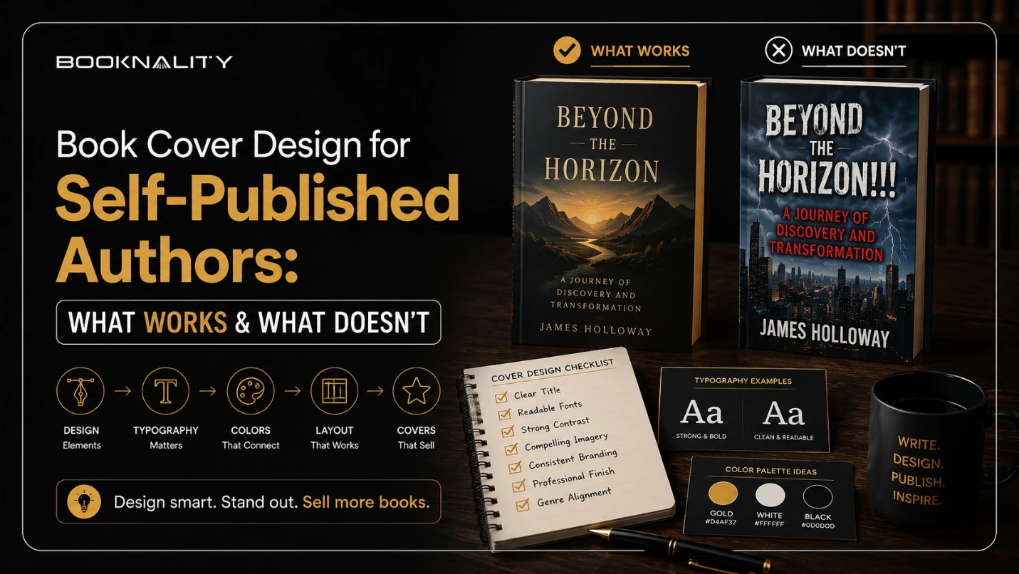
The most important job your cover has is telling the reader what genre your book belongs to. This happens through color palette, typography, imagery style, and overall composition. Readers are trained by thousands of previous covers to associate specific visual cues with specific genres.
- Thrillers use stark reds, blacks, and bold modern lettering
- Cozy romances use soft pastels, warm lighting, and elegant serif fonts
- Literary fiction tends toward minimalist compositions with restrained color palettes
- Fantasy and sci-fi use rich, detailed illustration with dramatic scale and atmosphere
When a self-published book cover matches the visual expectations of its genre, readers immediately trust that the book was written by someone who understands the space.
High Contrast and Simplicity
Covers that pop on screen use bold, clean color schemes rather than a chaotic mix of competing elements. A stark background with crisp white or bright accent text almost always outperforms a busy, multicolored design. We have seen authors simplify their covers by removing just one or two elements and immediately notice stronger click-through rates on retailer pages.
One Clear Focal Point
Strong covers commit to one dominant visual subject. A lone tree for nature writing. An embracing couple for romance. A shadowed figure for thriller or suspense.
Readable Typography
Your title needs to be massive. Not just large. It should be readable at a distance and at thumbnail scale without squinting. We recommend using one font for the title and a complementary but distinct font for the author name. Avoid decorative fonts that sacrifice legibility for style.
For authors who want to make sure their entire book, from cover to final page, reflects professional quality, exploring book publishing services can help ensure every element is aligned before release.
What Does Not Work on a Self-Published Book Cover
Knowing how to design a book cover that works requires equal awareness of what fails. These are the patterns we see most often on underperforming self-published book covers.
Visual Overload
Attempting to cram every scene, character, or symbolic detail from your story into one cover almost always results in a cluttered, confusing image.
Weak or Unbalanced Typography
Using small fonts for the title, plain fonts that look like a default Word document, or outlined and drop-shadowed text that floats disconnected from the background are some of the fastest ways to make a cover look unprofessional.
Low Resolution or Unlicensed Images
Free images pulled from the internet are almost always low resolution and potentially copyright-protected. Using them is a fast track to a cover that looks cheap and a potential legal problem.
The Uncanny Valley Effect
Poorly composited images where elements have mismatched lighting, unnatural scaling, or awkward positioning immediately break the reader’s visual trust. We call this the uncanny valley of book cover design.
How to Design a Book Cover That Passes the Thumbnail Test
Learning how to design a book cover that converts on digital storefronts requires understanding one critical reality. Most readers will first encounter your cover at roughly one inch by one and a half inches. That is the size of an Amazon search result thumbnail, and it is where the vast majority of purchase decisions begin.
Here is the thumbnail test we recommend to every author:
- Shrink your cover design down to thumbnail size on your screen
- If the title is unreadable at that size, it needs to be larger or simpler
- If the central image is indistinguishable, the design needs simplification
- If the overall color scheme blurs into a muddy mess, your contrast needs work
Authors looking to pair a professional cover with a fully polished manuscript can explore book editing services to make sure the interior quality matches the exterior promise.
Understanding Book Cover Design Cost
One of the most common questions we hear from self-published authors is how much they should expect to spend on a professional cover. Book cover design cost varies significantly depending on the approach you take, the complexity of the design, and the experience level of the designer.
Here is a realistic breakdown of what book cover design cost looks like at different tiers.
|
Design Approach |
Typical Cost Range |
What You Get |
| DIY using Canva or free tools | $0 to $50 | Basic design with limited customization and template-based layouts |
| Pre-made cover from a marketplace | $50 to $200 | A professionally designed cover sold to one buyer, with limited revisions |
| Freelance designer on Upwork or Reedsy | $300 to $800 | Custom design with revisions, genre research, and professional typography |
| Experienced specialist cover designer | $800 to $2,000+ | Fully custom illustration or composition, multiple concepts, full commercial rights |
We always advise authors to view book cover design cost as an investment rather than an expense. A $500 cover that converts at twice the rate of a $50 DIY design pays for itself within a few hundred sales. We have seen authors who upgraded to a professionally designed cover saw measurable improvement in both click-through rate and sales volume.
When to DIY and When to Hire a Professional
Not every self-published book cover needs a $1,500 designer. But not every book can get away with a Canva template either. Knowing where your book falls on that spectrum is an important practical decision.
DIY might work if:
- You have genuine design skills or experience.
- Your genre allows for minimalist typography-driven covers.
- You are publishing a short run or test edition before investing in a full launch.
- You are committed to studying genre conventions and applying the thumbnail test rigorously.
Hire a professional if:
- Your genre demands complex illustration, composition, or photo manipulation.
- You have no design experience and limited time to learn.
- Your book is the cornerstone of a personal brand or business strategy.
- You are planning a full launch with marketing support and want every element polished.
If you choose to hire a designer, platforms like Reedsy and Upwork offer access to vetted professionals with portfolio samples you can review before committing. We recommend reviewing at least three portfolios, checking genre-specific experience, and requesting a thumbnail mockup before approving any final design.
Authors who are building illustrated or visual books, particularly in the children’s category, can explore children’s book illustration services to get professionally crafted visuals that meet both creative and commercial standards.
Genre-Specific Book Cover Design Tips
While the fundamental principles apply across all genres, each category has its own visual language. Here are book cover design tips tailored to the genres we see most often.
Thriller and Suspense
Dark backgrounds, high contrast text, urban or atmospheric imagery, and bold sans serif fonts. Avoid soft or warm color palettes. The cover should feel tense before the reader processes a single word.
Romance
Warm tones, soft lighting, and character-driven imagery. Serif or script fonts work well for the title, depending on the subgenre. The cover should evoke the emotional tone of the relationship at the center of the story.
Nonfiction and Business
Clean layouts, bold title treatment, and minimal imagery. Nonfiction covers sell credibility. Strong typography and a professional color scheme signal authority more effectively than elaborate visuals.
Fantasy and Science Fiction
Rich illustration, dramatic scale, and otherworldly color palettes. This is one genre where investing in custom artwork almost always pays off. Readers in this category are highly visual and expect immersive cover art.
Memoir and Personal Narrative
Understated elegance with personal imagery or symbolic visuals. The cover should feel intimate and authentic. Overly polished or commercial-looking designs can feel misaligned with the deeply personal nature of memoir.
For authors who want broader guidance on how cover design fits into a full promotional strategy, the guide on the benefits of hiring a book marketing firm covers how professional marketing support connects every element of your book launch into a cohesive plan.
A Checklist Before You Finalize Your Cover
Before approving your final cover design, run through this checklist to make sure it is ready for market.
- Does it clearly signal your genre within two seconds?
- Is the title readable at thumbnail size?
- Does it have one clear focal point rather than multiple competing elements?
- Is the color palette high contrast and clean?
- Are all images licensed for commercial use?
- Does the typography look professional and intentional?
- Have you compared it side by side with the top-selling covers in your genre?
- Have you shown it to at least three people who read your genre and asked for honest feedback?
If every answer is yes, your cover is ready. If any answer is no, address it before publishing. We have seen authors delay their launch by a week to fix a cover issue and recoup that time many times over in stronger early sales.
For a broader look at the full self-publishing timeline and how cover design fits within it, the guide on how long it takes to self-publish a book provides helpful context on where each step belongs.
Frequently Asked Questions
Two Seconds Is All You Get. Make Them Count.
Your self-published book cover is the one element that determines whether your book gets that chance or gets skipped entirely. The book cover design tips in this guide are built on real patterns we have observed across hundreds of author projects, and they work because they are rooted in how readers actually behave rather than how authors wish they would.
If you are ready to build a self-published book that is professionally designed, strategically positioned, and ready to compete on any shelf or screen, Booknality works with authors to create publishing outcomes that look, read, and sell like the real thing, because they are.